Assignment 5 - Data Visualization
Due: 11:59PM Eastern Time, April 19th, 2022
Getting Started
Getting the stencil
You can click this link to get the stencil for this assignment.
Important: Please view Appendix A for the stencil code structure.
Python Data Visualization Modules
In this assignment, you may use packages that have not been installed on our course virtual environment. Please refer to Appendix B for instructions on how to install new modules on your virtual environment. You will not have the write access to install packages on the our course virtual environment on the department filesystem, so please let the HTA know if there is any Python module that is yet available in the course environment and you think should be added to the official course virtual environment.
Some modules that we recommend using in this assignment are: Pandas, Matplotlib, Seaborn, Plotly, and Sklearn (for your Machine Learning models, and for decision tree visualization).
Before you start…
Firstly, we recommend finishing the lab first before working on the assignment.
We also care about accessible data visualization. Before you start designing your dashboard, we want you to read the following articles about accessible Data Visualization:
- “5 tips on designing colorblind-friendly visualizations” (also covered in lab)
- “Why Accessibility Is At The Heart of Data Visualization” - particularly, pay attention to the Design equivalent experiences for all your readers section.
- “A Comprehensive Guide to Accessible Data Visualization” - the article should provide you with specific suggestions to make data visualization accessible to people with visual impairments.
Additionally, we hope that you will utilize the following tools:
- Colorblindness Simulator, where you can upload a photo (e.g., of a graph that you made), and it will output how the graph would look like if you have a certain type of colorblindness.
- Guide: Including Alt Text in Markdown files - this will give you some guide on how to include alt texts in your
writeup.mdreport.
Keep the principles from the readings in mind as you design and implement your dashboard. You should try your best to utilize these best practices in your graphs for this assignment, and note the times during your design and implementation process where you could and could not act on suggestions in the readings. You will answer questions about your observations after having produced all the visualizations.
We hope that this will be a fun assignment and will closely resemble future data science work!
Gradescope Autograder & Collaboration
Due to the free-form nature of the assignment, we do not have an autograder configured on Gradescope. Feel free to talk to your friends or come to TA hours to get feedback on your graphs (e.g., “does it make sense that I use graph X to communicate this information?” or “how do you feel about my design for graph Y”). However, you should be the one who determines the design choices and comes up with the code to produce the graphs.
We have been and will continue to use Gradescope on our assignments to check for code similarity between submissions.
Ethics Component (Part 1)
(10 points)
- (3 points) Look for a digital or coding tool that helps increase accessibility in data visualisations in some form. Name the tool, explain what it does, and give an example of which user group this tool could help. (We define tool loosely - it could be an add-on or interface or coding pieces that makes design more inclusive.) Examples of such a tool would be: Markdown Image Titles and Alt Text or Contrast Checker
- (3 points) Think about what datasets you can represent through a data visualization (ie. a graph), and list two scenarios where using a visualization aids a user’s experience and understanding of the dataset.
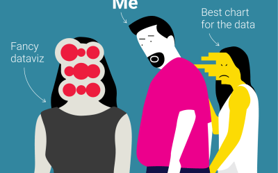
- (4 points) Look at this visualization. Now reflect on the actual content of the visualization. What does it mean to represent demographic data as a number or figure? Do you think it reduces the human experience? Is there any kind of data that you wouldn’t create a visualization out of? Why or why not?
Visualization Scenarios
(80 points)
In this assignment, there is no one way to do things: You are the person to make the design choices to visually analyze your data/your models. The design choices that you will make in this assignment include:
- What are the questions that I will graphically analyze?
- What kinds of plot will I produce to analyze my questions? Why?
- Out of the many Python visualization tools/packages, what will I use to produce the plots? How can I use it to make my graphs the most informative and accessible?
In response to the scenarios posed in this assignment, all the code that you write to produce the the answer plots should go in their respective files (as noted in each section). In writeup.md, you will have to include the produced plots, and write your answer to each question that you decide to analyze. Particularly, be sure to mention:
- Question: What is the question/aspect you want to analyze?
- Graph & Analysis: Include the graph(s) that you use to analyze the question/aspect. How should we interpret the graph(s)? How should we use this information to judge the model/the dataset, or to decide the next steps in our data analysis?
If you are ever in doubt about whether an aspect of analysis is “valid,” feel free to reach out to your TAs for help!
We will go through your code file to make sure that the code that you wrote correspond to the graphs that you produce, so please make sure to structure your code in the cleanest way possible so we can give you credit. We expect best design for your graphs. This means:
- Your graphs have to have clear graph titles, axis labels, and need to generally communicate information properly.
- Your graph needs to follow accessible graph design principles - e.g., think colors, sizes, or alt texts. Please refer to the lab and to the accessible design tools/articles above for more information regarding accessible visualization.
- Your graph communicates information well on its own, but you also do a good job with analyzing your graphs (refer to the questions mentioned above).
You are free to use any kinds of plots, packages, etc. - as long as you include your graphs in the graphs folder (and in the writeup.md) file.
Data
We will use two datasets in this assignment: The RI Traffic Stops Dataset, and the Banknote Authentication Dataset. The datasets and their details (features, source, acknowledgements) can be found in the data/ folder.
The data is labeled. More specifically:
- RI Traffic Stops Dataset: By default, the name of the target feature is
stop_outcome, and the names of the features are the rest of the attributes. - Banknote Authentication Dataset: By default, the name of the target feature is
Class, and the names of the features are the rest of the attributes.
Stage 1: Data Visualization in Data Exploration
(30 points)
Your code in this section goes into stage_one.py. You are expected to explore three aspects of your choice of your data (with at least one accompanying graph for each aspect). This applies to either of the provided datasets, which means that you only have to produce graphs to explore three aspects for both of the datasets, instead of having to address six aspects.
Some questions you might want to think about when exploring a dataset:
-
You want to build a Machine Learning model on the datasets, but as a stellar data scientist, you realize that you need to explore how the data distribution looks like first. What kinds of graphs will you produce to explore your data before you dive into building the model?
Hint: To build a good model, you may want to look at the distribution of the fields (of your interest) that exist in your dataset. For example:
- If a field consists of continuous numerical values: How are the values in this field distributed? What is the range, the median and standard deviation of the values in this field?
- If a field consists of categorical values: How many distinct categories can the values be divided into, if applicable?
- If your dataset has true target labels: Are the classes in your dataset are balanced (meaning, roughly the same amount of samples for each class)?
- Looking at multiple different fields, what is does the breakdown of the data look like? For example: looking at fields
AandB, how many samples have:(A,B) = (a_1, b_1)?(a_1, b_2)? (a_2, b_1)? And so on…
-
A picture is worth a thousand wordsA graph is worth a thousand numbers. Before we decide what to do next with the data - e.g., which machine learning model to use - it is important to visualize the dataset (and not just each feature’s statistics).In a supervised context where the dataset that you’re provided contains the target labels, you can just plot your data points from your original data and see if they are in " natural clusters" already. (Hint: Take a look at the functions
plot_multiclass_fig_2D,plot_fig_3D,plot_linear_line, andplot_linear_planeinsample.py!) You may want to explore if your data is linearly separable or are already clustered into almost distinct clusters - if it is, then you can just use super simple Machine Learning models - e.g., SVM with Linear Kernels, Logistic Regression, etc. - on your dataset, but if not, you’ll have to use more complex ones - e.g. SVM with more complex kernels, or deep neural networks.Hint: For a dataset with many different attributes, it might be hard for us to plot more than 3 dimensions at once. To handle this problem, you can reduce the dimensionality of your dataset to be either 2-dimensional or 3-dimensional (using methods such as Principal Component Analysis, or regression and picking the “most important” subsets of variables). You can visualize one graph of your most important features, or you can produce a few different graphs to visualize different subset of features to derive your conclusions about the data.
Some examples of aspects that you can analyze:
- In the RI Transit Stops Dataset, how many examples (rows) are of each class? What are we to make of the kind of Machine Learning models that we should use on this dataset?
- In the Banknote Authentication Dataset, are the data points linearly separable / almost linearly separable? What are we to make of the kind of Machine Learning models that we should use on this dataset?
- In the RI Transit Stops Dataset, what does the breakdown of the data look like when looking specifically at the features
'driver_race'and'search_conducted'? How about'driver_race'and'stop_outcome', or'driver_race'and'is_arrested'? What can we say about the relationship between our features of interest, if at all? - How does the number of traffic stops change through the years in the Transit Stops Dataset?
- What is the distribution of the continuous variables in the Banknote Authentication Dataset?
Stage 2: Data Visualization for Model Exploration
(30 points)
Your code in this section goes into stage_two.py. You are expected to explore three aspects of your choice of your Machine Learning models - again, with at least one accompanying graph for each aspect.
In utils.py, we have built the code to build four different Machine Learning models (decision tree, k-nearest neighbor, logistic regression, and dummy classifier) – examples for how to use our code to get the trained models can be found in sample.py. Feel free to build your own ML models, change the code that we have provided for you in utils.py, etc. – whatever that helps you produce the graphs!
Some examples of aspects that you can analyze:
- What are the true positive, false positive, true negative and false positive rates in each model? What can we say about the the performance of each model using this? You may find plotting confusion matrix useful to support your answer.
- What is the change in performance as you tweak your models? That is, how does changing the
kin the k-nearest neighbor algorithm impact the accuracy? What is the accuracy of a model that is trained using only 3 features, in comparison to those that use 4 or 5 features? - How do your models do in comparison to a baseline/dummy model (a model that predicts using super simple heuristics like random guessing or most-likely-outcome guessing)?
- What is the decision making process that your model used to make the predictions? What were the splits that your decision tree made), or what are the coefficients that your model assigned to each features? What can we say about these significant features in these models?
Note:
- In our ML models, we use sklearn’s
OneHotEncoderto encode our non-numerical, categorical features. You can read more about OneHotEncoder here if you are not familiar, and the TAs are here to help!
Stage 3: Data Visualization for SICK Applications
(20 points)
Code in this section goes into stage_three.py.
In this section, you will produce a geographic map to visualize the traffic stop data per county in Rhode Island. We recommend that you use Plotly (and we have an example for you in sample.py). You are expected to produce at least one geographic map of your choice!
Some examples of graphs that you can make:
- What is the total number of traffic stops through from 2005 - 2015 per each county?
- What does the disparity in traffic stops look like in each county? Think the difference between the number of traffic stops on drivers of some race versus some other (dividing by the number of traffic stops in that county).
We recognize that it is hard to have the hover effects that Plotly interactive graphs provide when just downloading and including a static image in the writeup. Therefore, you can just include a static graph in your writeup, and we will check your code to see your Plotly graph(s) on our machines later – no penalty at all!
Ethics Component (Part 2)
(10 points)
- (8 points) Evaluate the accessibility of the graphs that you produced.
- Specifically: Name two user groups that should find your graphs accessible and explain why. (A user group would be a subset of your users who share a common trait, for example: children, or people with hearing difficulties)
- Name two user groups who may have difficulty accessing your graphs and explain why. (Hint: Disability can be permanent, temporary, or situational as mentioned in the above readings)
- Given more time and resources, list two actions that would make this dashboard more accessible to a wider audience. Talk about how you could implement these steps in the future. If not, why? Reflect on these choices.
- (2 points) Think about the stages of your design and implementation process. What did you find easy about factoring accessible visualization practices into your graphs? List two factors.
Handing In
As per usual, please run python3 zip_assignment.py to zip the assignment and submit onto Gradescope. The script will include all the files in your directory (e.g., all the code .py files, all your graphs, and the writeup.md of your report), except for the files in the data folder.
After submitting, please make sure that your Gradescope submission includes your filled-out writeup.md report and all the code that you use to produce the graphs in your report.
Note: Manually zipping your files risks (1) not including some files that will be used as part of our grading, and (2) your code not upholding our anonymous grading policy. Please use the zip_assignment.py script to zip and submit, or directly submit through Github.
Credits
This assignment was made by Nam (ndo3) in Summer 2021 and updated by Aakansha Mathur (amathur7) in Spring 2022.
Appendix
Appendix A: Stencil Code Structure
The structure of the stencil is as follows:
-
code/: Folder that contains all the code. You can make as many helper.pyfiles as you want here, and they will all be included in the submission.stage_*.py: the respective Python files in which you will write your code to produce the answers for the assignment.utils.py: the helper functions that we have written for you, which you can import in yourstage_*.pyfiles using the following syntax:from utils import *. The functions include:get_ri_stops_dfandget_banknote_df: Functions to load the data (as a DataFrame)get_trained_model: Function to get trained ML models (Logistic Regression, Decision Tree, K-Nearest Neighbors, and dummy baseline classifier)get_model_accuracy: Function to evaluate trained ML models
sample.py: This contains examples for how you can draw certain kinds of plots usingMatplotlibandPlotly, as well as for how you can use the functions inutils.py
-
data/: Folder that contains all the data (.csvfiles) and their README files (which contains information on what each attribute means and the data type). -
graphs/: Folder that should contain all the graphs that you will (1) include inwriteup.md, and (2) submit to us. -
writeup.md: You will include the graphs that you made in this assignment and your response to each stage in this file. Answers to the Socially Responsible Computing questions also go here.
Appendix B: How to install a new package in your own virtual environment
Note: The instructions below only work on your own virtual environment. If you are using the official course virtual environment on the department machine (e.g. at /course/cs1951a/venv), you will not have the write permission to install new packages in the virtual environment – please reach out to the HTA if the package that you’re interested in using for the assignment is not available and you think should be added to the official course virtual environment.
Step by step instructions: If you run into any roadblock following these steps, feel free to come to TA hours for more support!
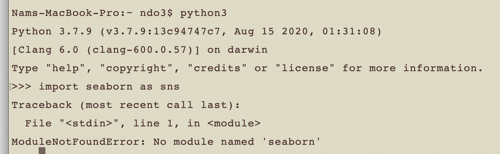
Suppose you are trying to import a package X to use in your Python program. In this example, we will use Seaborn package as X - using the import statement import seaborn as sns. However, Python is not happy about you using that statement, and gives you the error message ModuleNotFoundError: No module named X (in this case, ModuleNotFoundError: no module named 'seaborn')
-
Step 1: Activate your course virtual environment (e.g., using the
cs1951a_venvcommand that we have set up in Homework 0, our usingsource PATH/TO/YOUR/VIRTUAL/ENVIRONMENT/bin/activate). Try Googling how to activate your virtual environment (this page might be helpful) if you don’t know how to.This step is to make sure that your module is installed to the virtual environment with which you will run your code for the assignment.
-
Step 2: In your terminal, type in
pip3 install <NAME-OF-MODULE>orpython3 -m pip install <NAME-OF-MODULE>.In the example above, the command would be
pip3 install seabornorpython3 -m pip install seabon.After you have successfully installed the module, the last line/one of the last lines displayed in your terminal should say
"Successfully installed <MODULE-NAME>-<MODULE-VERSION>"(in my case, that would beseaborn-0.11.1) -
Step 3: See whether the module is successful installed on your machine by running your program (that contains the import line again). If it does not (the
ModuleNotFoundErrorshows up again), feel free to come to TA hours for help! Be sure that you are in the virtual environment when installing the module and when running the code that contains the module import statements.